Screen organisation
An Application Customisation screen is divided in three parts:
- The Button Bar
- The Navigation Tree
- The Edit Panel
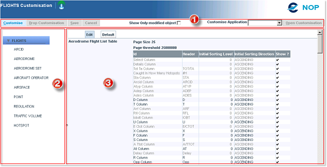
1. The Button Bar
Four buttons and a check box are available here - this is where you perform the various actions in relation with the customisation process.
Customise - Button
By default, when you first open the Editor, the Customise button is active and the remaining three buttons are disabled:

You need to click on the Customise button to unlock the editable fields and start making your changes. By doing so, the status of buttons changes:

Customise gets disabled, while Save and Cancel are now active.
Drop Customisation - Button
The Drop Customisation function is only available after having modified and changed the settings by means of the Save button. Use it to remove all your changes and restore the defaults settings.

Save - Button
The Save function allows you to persist your changes on the NOP server - making your new settings available for the next login.

Cancel - Button
The Cancel button is used to undo all changes made within a given session since the last Save.
Show Only modified object - Check box
This box filters the elements displayed in the Edit panel to show only those which were modified. This feature is specially useful when the root level (the first level available) is selected in the Navigation Tree.
Customise Application - Select

This allows you to customise another application from within the Customisation Editor, without the need to close the window and return to the Main View.
2. The Navigation Tree
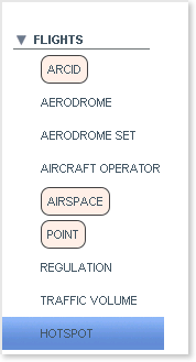
The navigation tree presents the different levels (or nodes) which you can individually access to make changes to the application settings.
The Root level (the first level) acts as a files folder - simply click on the arrow on the left of the application name (in this case, FLIGHTS) to expand or collapse it and as a result, show or hide its content.
Next, click on the node at which level you want to make changes, to load its content in the Edit Panel.
The editor keeps track of your unsaved changes, and highlights the modified nodes in a light pink box. In this example, you can see that ARCID, AIRSPACE and POINT were modified.
Lastly, the currently selected node (HOTSPOT in this case) is shown against a blue background.
The Edit Panel
The Edit Panel comprises two tabs: the Edit tab and the Default tab.
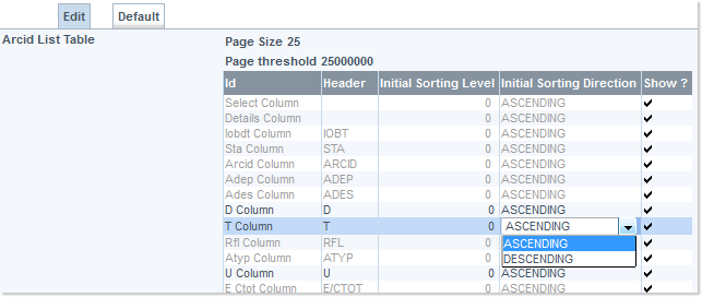
Edit Tab
The Edit tab is where you can make changes to the settings. The editable parameters are displayed in black.
They are presented in various ways, depending on their nature:
- check boxes
- pull-down lists
- radio buttons
- text fields
- ...
Some components, most often from rows in tables, do present parameters which are not editable - these are displayed in grey.
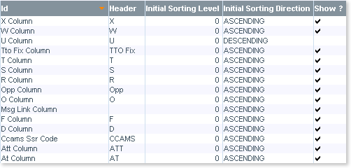
Sorting in tables
You can also sort the tables to best accommodate your working method: simply click on a column header to have the rows sorted by ascending or descending order. The example below shows the content of a table sorted by Id - Descending (see how the orange triangle is pointing down). Click again on the column header to change the ordering method (descending to ascending, and conversely).
Default Tab
The Default tab shows the values set by default for the selected element. This can be helpful when you do not remember where you made changes, or to manually restore individual parameters to their default value.
The Drop Customisation function (see above) restores the elements to the values set in the Default tab - undoing all changes in the process.